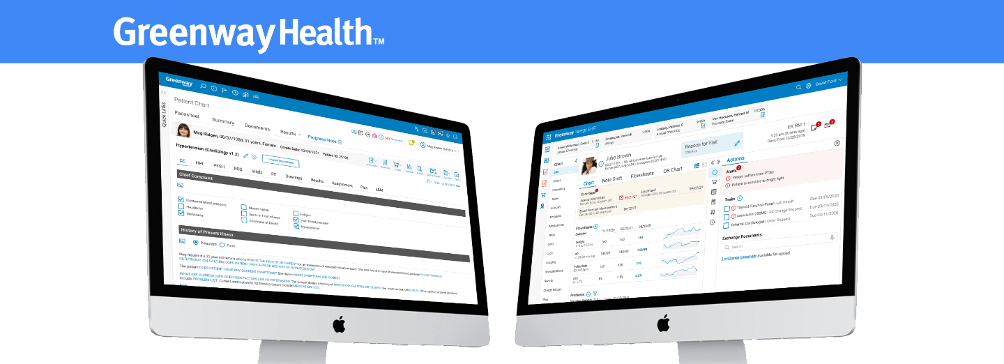
Greenway Intergy Modernization™

Context

As the healthcare industry rapidly transitions toward value-based care, electronic health record (EHR) platforms must evolve to meet the demands of modern care delivery. Greenway recognized the limitations of its flagship product, Intergy, which had served customers for years but had become outdated. The aging codebase and cumbersome interfaces no longer optimized workflows or supported real-time decision-making, vital under emerging payment models. To maintain its relevance and value, Intergy required a comprehensive redesign—not incremental updates, but a full modernization effort.

“As a Greenway client for over 15 years, our practice has always appreciated Greenway’s willingness to listen to our biggest needs, and to then put those desires into action.” - Dr. David McAnulty, Northwest Primary Care

Objective

The goal was to reimagine Intergy as a next-generation EHR solution that prioritized usability, flexibility, and advanced analytics. The redesign needed to address user pain points, optimize workflows for both clinicians and administrative staff, and integrate new tools for real-time decision support. This effort would not only modernize Intergy’s technical foundation but also position it as a leader in facilitating value-based care models.

Key objectives included:

  • Streamlined workflows that reduced cognitive load for providers.

  • Modernized, intuitive interfaces designed to empower users.

  • Advanced analytics and real-time decision-making tools to support evolving care models.

  • Improved user satisfaction and long-term customer retention through a user-centered approach.

My Role

As a Senior UX Designer, I played a pivotal role in Intergy’s modernization, working as part of a cross-functional team alongside product managers, developers, and customer representatives. My responsibilities included:

  • Leading user research efforts to uncover pain points and opportunities.

  • Designing and iterating on prototypes and wireframes informed by user feedback.

  • Conducting usability testing to validate design decisions and improve functionality.

  • Collaborating with internal stakeholders to ensure alignment with business goals.

My primary focus was to create a simplified, user-centered experience that balanced ease of use with the advanced functionality required to support value-based care initiatives. By championing the voice of the user throughout the process, I ensured that every design decision was grounded in real-world needs.

Methodology

To achieve the ambitious goals of this project, I employed a human-centered design approach that combined research, rapid prototyping, and iterative testing. Below is an overview of the process:

1. Discovery and Research

We began by conducting extensive research to understand the needs and challenges of Intergy’s diverse user base, including:

  • User interviews with clinicians, administrators, and IT staff to identify pain points.

  • Workflow analysis to pinpoint inefficiencies and opportunities for optimization.

  • Competitive benchmarking to assess industry standards and potential innovations.

Key insights from this phase revealed that:

  • Users struggled with cumbersome interfaces that slowed down clinical workflows.

  • Decision-making was hindered by a lack of real-time analytics and actionable insights.

  • The platform’s complexity created a steep learning curve for new users.

2. Ideation and Rapid Prototyping

Armed with these insights, we conducted ideation workshops to generate potential solutions. From there, we:

  • Created low-fidelity wireframes to explore different design directions.

  • Quickly transitioned to interactive prototypes to bring concepts to life.

3. Iterative Testing and Refinement

We employed a rigorous, iterative process to validate and refine our designs:

  • Internal design reviews with cross-functional teams provided early feedback.

  • Usability testing sessions with real users gathered qualitative and quantitative data.

  • Stakeholder workshops helped ensure alignment with business priorities.

Each round of testing uncovered actionable insights, which informed subsequent iterations. For example:

  • Early prototypes revealed that users preferred streamlined workflows with fewer clicks and intuitive navigation paths.

  • Stakeholders highlighted the need for customizable dashboards to accommodate different practice needs.

4. High-Fidelity Prototyping and Validation

As designs matured, we developed high-fidelity prototypes that simulated real-world usage scenarios. These prototypes were tested:

  • In-context during user workflows to assess their impact on efficiency.

  • With both new and experienced users to ensure the solution worked across experience levels.

This iterative process continued throughout development, ensuring the final product was fully optimized for its users.

Results

The Intergy modernization effort has already delivered significant improvements, with early results demonstrating:

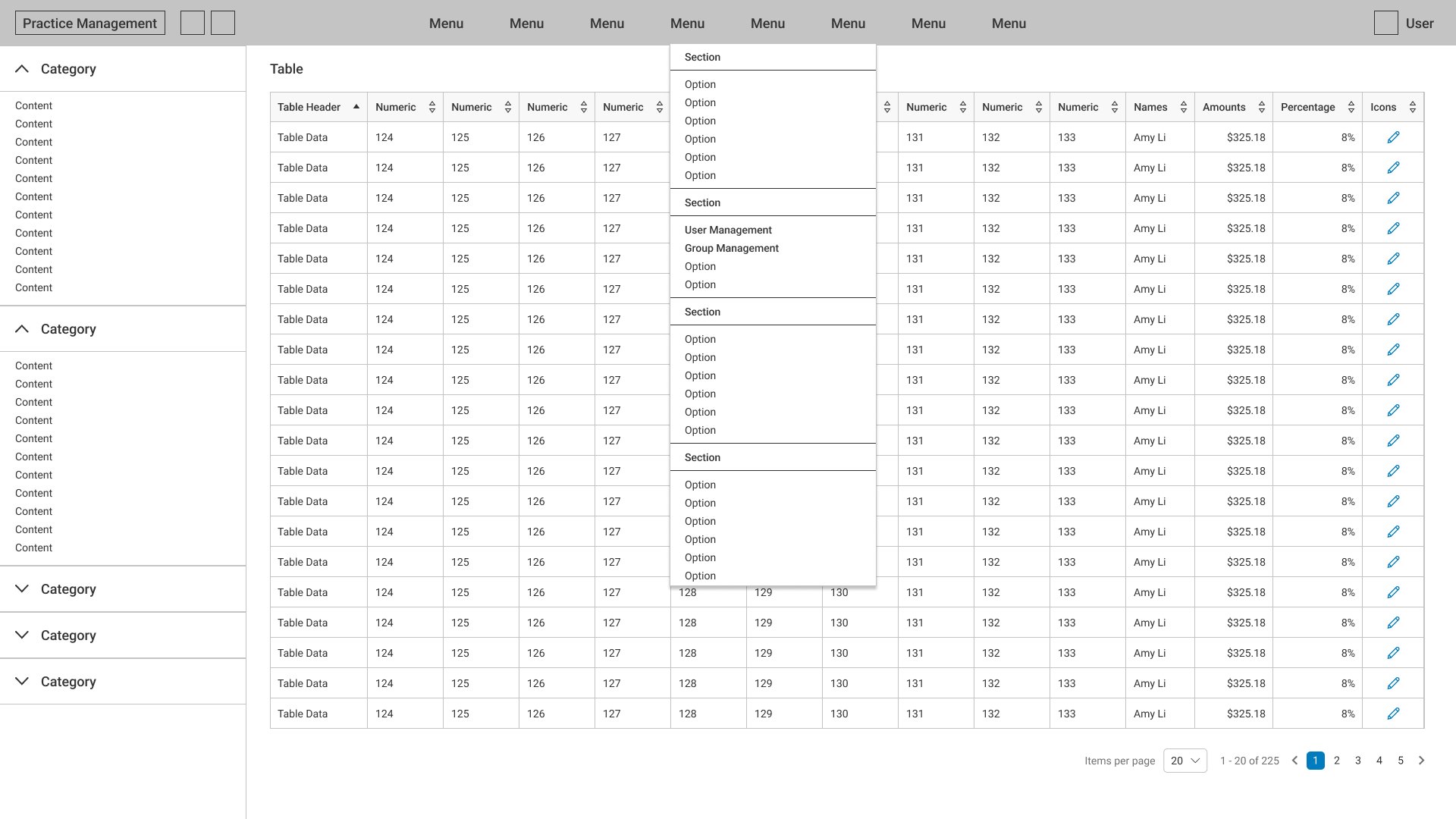
  • Enhanced usability: Redesigned interfaces have reduced cognitive load and improved workflow efficiency, earning positive feedback from users.

  • Faster adoption: Streamlined navigation and simplified functionality have made it easier for new users to onboard.

  • Improved decision-making: New analytics tools provide actionable insights in real-time, empowering providers to succeed under value-based care models.

While the project is still ongoing, the foundation we’ve established positions Intergy as a next-generation EHR solution that meets the demands of modern healthcare. The next phase will focus on expanding advanced analytics and connectivity features, ensuring the platform remains at the forefront of healthcare’s digital transformation.

TAKEAWAYS

This project demonstrated the power of a user-centered, iterative design approach in solving complex problems. By consistently prioritizing user needs and working collaboratively with cross-functional teams, we were able to:

  • Reimagine a legacy platform into a modern, intuitive solution.

  • Build a scalable foundation for future innovation.

  • Deliver meaningful improvements that will have a lasting impact on healthcare providers and patients alike.

Through this experience, I’ve honed my ability to lead large-scale, cross-functional projects and solve complex design challenges in highly regulated industries. I’m excited to bring this expertise to my next opportunity, where I can continue to design solutions that drive meaningful change.

Greenway® CLINICAL ASSIST

Context

Healthcare providers face significant administrative burdens, with documentation consuming up to 40% of their workday. This often detracts from the time available for patient care, contributing to provider burnout and weakening the patient-provider connection. Recognizing the need to reclaim this valuable time, Greenway Health set out to develop a groundbreaking solution: Greenway Clinical Assist, an AI-powered ambient listening and documentation tool.

Greenway Clinical Assist leverages ambient AI technology to automate clinical note generation, instantly transforming speech into structured, comprehensive clinical notes. By reducing the time spent on documentation, the tool empowers providers to focus on what matters most—delivering high-quality, personalized patient care.

Problem

Clinical documentation is one of the most significant contributors to provider burnout. Traditional documentation methods, whether manual or assisted by basic transcription tools, are time-consuming, error-prone, and disruptive to the patient-provider interaction.

Key challenges included:

  • Efficiency: Providers needed a solution that could generate accurate, structured clinical notes instantly, eliminating the need for lengthy post-visit documentation sessions.

  • Quality: Clinical notes had to be comprehensive and adhere to provider-specific preferences, including structure, narration, and content order.

  • Connection: Documentation workflows often distracted providers during patient visits, weakening relationships and undermining the quality of care.

The challenge was to design a solution that seamlessly integrates into providers’ workflows, reduces cognitive load, and streamlines documentation without compromising accuracy or the human connection in care delivery.

Objective

The goal was to design and develop an intuitive mobile ambient documentation tool that:

  1. Automates clinical documentation in real-time, reducing administrative burden and saving providers up to two hours per day.

  2. Ensures accurate, structured, and personalized clinical notes, tailored to provider preferences and workflows.

  3. Strengthens the patient-provider relationship by allowing providers to focus fully on patient care during visits.

  4. Offers a scalable, user-friendly interface that integrates seamlessly into existing healthcare systems and workflows.

By prioritizing efficiency, accuracy, and usability, the objective was to create a product that not only solves the immediate problem of documentation but also transforms the future of healthcare delivery.

My Role

As the Lead UX Designer for Greenway Clinical Assist, I was responsible for driving the design process from concept to production. My involvement included:

  • Leading user research to uncover pain points, needs, and opportunities for innovation.

  • Developing low- and high-fidelity wireframes, prototypes, and interaction flows.

  • Collaborating with product managers, engineers, and clinical stakeholders to align on requirements and ensure seamless implementation.

  • Designing an intuitive interface optimized for mobile use, ensuring accessibility and ease of adoption for busy providers.

  • Conducting usability testing and iterative refinements to deliver a solution that met user needs while aligning with business goals.

From initial sketches to a production-ready product, I shaped the user experience of Greenway Clinical Assist, ensuring it balanced the complexity of AI-powered technology with the simplicity required for seamless adoption in clinical settings.

Methodology

To deliver a solution that met both user and business needs, I employed a user-centered, iterative design process that emphasized research, collaboration, and continuous validation. Key steps included:

1. Research & Discovery

  • Conducted in-depth interviews with providers to understand their pain points and goals related to documentation.

    • Insights revealed that providers spent an average of 2-3 hours per day on documentation, leading to frustration and burnout.

    • Key user needs included accuracy, speed, and customization, as well as the ability to preserve the natural flow of patient conversations.

  • Analyzed competitive products to identify gaps and opportunities for differentiation, such as real-time note generation and personalization.

2. Ideation & Concept Development

  • Created low-fidelity wireframes to explore potential workflows, focusing on minimizing cognitive load and ensuring seamless integration into providers’ routines.

  • Designed interaction flows that emphasized real-time documentation, customization options, and ease of navigation within a mobile interface.

  • Collaborated with the AI development team to ensure the backend technology aligned with the front-end user experience, particularly in areas like note structuring and learning user preferences.

3. Prototyping & Testing

  • Developed high-fidelity interactive prototypes to simulate real-world use cases, including live patient visits and post-visit note reviews.

  • Conducted usability testing with a diverse group of providers, gathering both qualitative and quantitative feedback.

    • Testing revealed that providers valued the ability to customize note structure and review AI-generated notes quickly before finalizing.

  • Iterated on the design based on testing insights, refining workflows, visual hierarchy, and interaction patterns to ensure maximum usability.

4. Implementation & Beta Testing

  • Worked closely with engineering teams to ensure the design was implemented accurately and optimized for mobile performance.

  • Launched a beta program to gather real-world feedback from providers using the tool in clinical settings, identifying areas for further refinement before full production.

Solution

The final design for Greenway Clinical Assist is a mobile-first ambient documentation tool that seamlessly integrates into providers’ workflows. Key features include:

  1. Real-Time Documentation:

    • Automatically listens to patient-provider conversations and generates clinical notes within 10 seconds of the visit.

    • Uses AI-powered language processing to ensure notes are accurate, comprehensive, and compliant with clinical standards.

  2. Customization & Personalization:

    • Allows providers to customize note structure, narration, and content order based on their preferences.

    • AI learns over time, adapting to individual provider habits to improve accuracy and efficiency.

  3. Streamlined User Interface:

    • A clean, intuitive mobile interface optimized for one-handed use, allowing providers to review and finalize notes effortlessly.

    • Smart review tools highlight key details, enabling providers to quickly verify and edit notes before submission.

  4. Improved Patient-Provider Connection:

    • By eliminating the need for manual note-taking, providers can focus fully on patients during visits, fostering stronger relationships and better care outcomes.

Results

Though still in beta, Greenway Clinical Assist has already demonstrated significant impact, with early feedback and metrics highlighting its value:

  • Efficiency Gains: Providers reported saving an average of 2 hours per day on documentation, significantly reducing administrative burden and allowing more time for patient care.

  • Improved Accuracy: Usability testing revealed a 90% success rate for AI-generated notes requiring minimal edits, demonstrating the tool’s reliability and precision.

  • High Satisfaction:

    • Providers praised the tool’s ability to adapt to their unique preferences:

      • “It feels like the tool was designed just for me—it learns how I work.”

    • Many noted how the tool improved their connection with patients:

      • “I no longer feel like I’m stuck behind a screen during visits. I can actually focus on my patients.”

Quantitative Metrics:

  • Task Completion Times: Note finalization times decreased by 50%, demonstrating the efficiency of the smart review tools.

  • Adoption Rates: Over 85% of beta participants indicated they would continue using the tool after the beta period, citing time savings and ease of use as primary benefits.

Takeaways

This project reinforced the importance of balancing cutting-edge technology with human-centered design. By focusing on the needs of providers, I was able to:

  • Simplify complex workflows without sacrificing functionality.

  • Design a product that empowers users to focus on their core mission—delivering quality care.

  • Create a future-ready solution that adapts to providers’ evolving needs through AI and personalization.

Through this experience, I honed my ability to lead projects from concept to production, collaborate with cross-functional teams, and design innovative solutions for complex, high-impact problems. I’m excited to apply these lessons to future projects, driving meaningful change through thoughtful, user-centered design.

Case Study - a Family-Centric Mobile Healthcare Scheduling Experience

Disclaimer: The following is a hypothetical scenario created for educational purposes. It does not relate to any actual products, organizations, projects, or proprietary information.

Context

As mobile health continues to grow, patient preferences are shifting toward solutions that work seamlessly on mobile devices. Analytics revealed that over 60% of users were accessing an existing patient portal via mobile, despite it being designed primarily for desktop use. This mismatch in design and usage highlighted a critical need for a modern, mobile-first experience.

Additionally, 40% of American adults have at least one child under 18 in their household. These busy caregivers face unique challenges when managing healthcare for multiple family members. Existing solutions required multiple logins and clunky, desktop-centric workflows, which added unnecessary complexity to their already hectic schedules.

Caregivers needed a streamlined, intuitive way to schedule and manage appointments for their entire household, all from their phones. Addressing this demand was crucial to improving patient engagement and meeting the evolving expectations of families.

Generic PM layout with displayed menu.

Problem

The growing trend of mobile health revealed a gap in functionality for caregivers managing healthcare for multiple family members. Existing solutions:

  • Were desktop-first adaptations that felt clunky on mobile devices.

  • Lacked unified scheduling capabilities, forcing caregivers to toggle between logins for individual family members.

  • Did not account for the on-the-go lifestyles of caregivers who needed quick, one-handed solutions.

The challenge was clear: caregivers needed a dedicated mobile solution that enabled them to effortlessly schedule and manage appointments for their entire household. This required rethinking the scheduling experience from the ground up, with a focus on convenience, simplicity, and speed.


Objective

The objective was to design and develop an intuitive mobile scheduling experience tailored to the needs of busy caregivers. The solution would:

  • Allow caregivers to schedule healthcare appointments for themselves and all family members in a single session.

  • Provide real-time availability views across multiple providers, enabling quick comparisons of locations, doctors, and times.

  • Optimize the interface for one-handed use, accommodating caregivers’ on-the-go lifestyles.

  • Leverage predictive intelligence to suggest optimal appointment times based on historical data, reducing scheduling conflicts.

By creating a family-centric, mobile-first solution, the goal was to save time, reduce frustration, and enhance user satisfaction while increasing patient engagement on mobile platforms.

My Role

As the Senior UX Designer leading this project, I was responsible for:

  • Researching user needs through interviews, surveys, and contextual inquiries to uncover pain points and opportunities.

  • Designing and prototyping new scheduling workflows that prioritized simplicity and accessibility.

  • Facilitating participatory design workshops with stakeholders and users to refine concepts.

  • Conducting usability testing to validate and iterate on design solutions.

  • Collaborating closely with developers and product managers to ensure seamless implementation.

My role required balancing the complexity of healthcare workflows with the demand for a simple, user-friendly experience. By championing a user-centered approach, I ensured the solution met the needs of caregivers while aligning with business objectives.

Methodology

To tackle this challenge, I employed a user-centered, iterative design process that emphasized collaboration and adaptability. Key steps included:

1. Discovery & Research

  • Conducted user interviews with caregivers to understand their scheduling habits, pain points, and priorities.

  • Analyzed analytics data to identify common usage patterns and areas of friction in the current system.

  • Performed competitive analysis to benchmark against other mobile scheduling solutions.

Key insights:

  • Caregivers struggled with fragmented workflows and multiple logins when managing family appointments.

  • Mobile users prioritized speed, simplicity, and real-time availability over advanced features.

  • Many users accessed scheduling tools while multitasking, highlighting the need for one-handed design.

2. Ideation & Prototyping

  • Hosted ideation workshops to brainstorm solutions that addressed user pain points.

  • Created low-fidelity paper wireframes to explore layout options and scheduling flows.

  • Developed interactive prototypes to replicate real-world usage and test proposed solutions.

3. Iterative Testing & Validation

  • Conducted usability testing with caregivers to validate early designs and gather feedback.

  • Incorporated stakeholder feedback during participatory design workshops to ensure business goals were met.

  • Refined prototypes into high-fidelity designs, incorporating insights from testing.

Notable improvements during iterations:

  • Added a unified scheduling flow that allowed caregivers to book for multiple family members in one session.

  • Designed a real-time availability view to simplify provider comparisons.

  • Introduced predictive scheduling suggestions to minimize conflicts with school and activity schedules.

4. Development Collaboration

  • Provided detailed design specifications and assets to the development team.

  • Worked closely during sprints to ensure the designs were implemented accurately and optimized for mobile.Solution

The solution was to develop a unified healthcare appointment scheduling section specifically designed for families within the larger MHR app. By allowing authorized caregivers to schedule for all household members from a single portal, significant time savings and convenience could be achieved compared to separate logins and processes.

The redesigned interface presents availability views for multiple providers on one screen, empowering users to easily compare schedules and select the most suitable option based on preferences like location, doctor, and time. Users can book for themselves as well as any children or other relatives requiring care with just one session.

An advanced version implements predictive intelligence and machine learning capabilities. By analyzing historical appointment and utilization data, the section suggests optimal dates and times that avoid common conflicts like school schedules or recurring activities. Over time, the AI model becomes more accurate as it assimilates aggregated insights from many caregivers.

Through user-centered design and an iterative development approach, this scheduling section aimed to streamline the process. By meeting users with an experience tailored specifically for managing an entire household's healthcare needs, frustrations and coordination difficulties would be reduced. Improved access to care and higher levels of engagement were ultimately the goals.

Solution

The final solution was a family-centric scheduling section within the mobile health record (MHR) app. Key features included:

  • Unified scheduling: Caregivers could manage appointments for all family members from a single portal, eliminating the need for multiple logins.

  • Real-time availability views: Users could instantly compare schedules across providers, locations, and times on one screen.

  • Predictive intelligence: The system suggested optimal appointment times based on historical data, reducing conflicts with school or recurring activities.

  • Optimized mobile interface: A clean, intuitive design enabled one-handed use, accommodating caregivers’ busy, mobile lifestyles.

By addressing core pain points and leveraging user-centered design principles, the solution provided significant time savings and convenience for busy families.

Results

The redesigned mobile scheduling experience delivered measurable improvements in user engagement and satisfaction:

  • 30% increase in mobile scheduling adoption within the first three months of launch compared to desktop usage.

  • 95% task completion rate during usability testing, with participants successfully booking appointments without assistance.

  • Positive user feedback highlighted key benefits:

    • Unified scheduling saved caregivers significant time.

    • Real-time availability views simplified decision-making.

    • Predictive suggestions reduced scheduling conflicts.

Testimonials from users:

  • “It’s so much easier to schedule for my kids now. I don’t have to log in and out for each of them!”

  • “The availability view lets me compare doctors and times in seconds. It’s a game-changer.”

By meeting caregivers where they are—on their mobile devices—the MHR app transformed the scheduling experience. It empowered families to take control of their healthcare while reducing stress and improving access to care.

Takeaways

This project underscored the importance of user research and iterative design in creating solutions that address real-world needs. By focusing on simplicity, usability, and convenience, we were able to:

  • Deliver a mobile-first experience that resonated with busy caregivers.

  • Increase patient engagement by optimizing for the most-used platform—mobile.

  • Lay the foundation for future enhancements, including AI-driven personalization and expanded family management features.

Through this experience, I refined my ability to lead complex, user-centered projects and deliver impactful solutions that balance user needs with business goals. I’m excited to bring these skills to my next opportunity, designing products that make a meaningful difference in people’s lives.

Greenway Telehealth™

Context

As healthcare shifts from being predominantly in-person to incorporating virtual care, medical practices require solutions that seamlessly integrate diverse care delivery modalities. Recognizing this need, Greenway Health tasked our UX team with developing an accessible Telehealth platform that would expand access to care in a cost-effective, patient-centered manner. This initiative emerged as a critical response to the pandemic-driven demand for virtual care while laying the groundwork for healthcare's evolving future.

“Virtual care tools are the future of healthcare delivery, and we are proud to have worked so closely with our customers to develop this solution that meets their unique needs.”
– David Cohen, Chief Product and Technology Officer, Greenway Health

Problem

The pandemic created an urgent need for scalable Telehealth solutions to ensure patients could continue receiving care while minimizing risks associated with in-person visits. However, many existing virtual care tools lacked the intuitiveness, flexibility, and extensibility necessary to meet both immediate needs and the future demands of a rapidly evolving virtual care landscape.

Key challenges included:

  • Developing a seamless user experience for patients and providers navigating virtual care for the first time.

  • Designing for scalability and adaptability, ensuring the platform could evolve alongside shifting healthcare regulations, technologies, and care delivery models.

  • Addressing long-term sustainability, enabling providers to transition from crisis-driven adoption to hybrid care models that blend in-person and virtual care.

The challenge was not just to create a short-term solution but to design a future-proof platform capable of supporting ongoing innovation and transformation in the healthcare industry.

Objective

The primary objective was to design an intuitive, adaptable Telehealth platform that addressed the immediate pandemic-driven demand for virtual care while also ensuring long-term scalability and extensibility. Specific goals included:

  • Immediate impact: Create a user-friendly platform that allowed providers and patients to transition seamlessly to virtual care during the public health crisis.

  • Future-proofing: Engineer a flexible architecture and user experience that could evolve alongside emerging virtual care technologies, regulations, and hybrid care models.

  • Sustained value: Ensure the platform maintained relevance and usability as the virtual care market matured, enabling providers to continue delivering high-quality, accessible care.

By prioritizing flexibility, adaptability, and user-centered design, the goal was to establish a Telehealth platform that would remain a foundational solution for Greenway Health’s customers long after the immediate crisis had passed.

My Role

As the Senior UX Designer leading this initiative, I was responsible for both the initial design and the ongoing refinement of the platform with a focus on long-term sustainability. My key contributions included:

  • Conducting exploratory research to identify pain points, user needs, and industry trends.

  • Designing and prototyping workflows and interfaces that balanced immediate usability with future scalability.

  • Leading usability testing and collaborating with cross-functional teams to iterate and refine the design.

  • Ensuring the platform aligned with Greenway Health’s broader strategic goals by prioritizing extensibility and innovation.

My vision extended beyond meeting the immediate crisis-driven demand. By focusing on longevity and adaptability, I aimed to establish the Telehealth platform as a cornerstone of Greenway Health’s product ecosystem, capable of supporting providers’ evolving needs for years to come.

Methodology

To address both short- and long-term needs, I employed a user-centered, iterative design process that combined research, rapid prototyping, and continuous testing. Key steps included:

1. Research & Discovery

  • Conducted desk research to analyze market trends, industry regulations, and emerging technologies in Telehealth.

  • Facilitated stakeholder workshops with providers, patients, and internal teams to understand pain points and future-use scenarios.

  • Collected qualitative feedback through interviews and surveys to uncover the needs of first-time virtual care users and experienced providers.

Key insights:

  • Many providers struggled with existing Telehealth tools that were overly complex and not integrated into their existing workflows.

  • Patients needed a simple, intuitive interface to reduce anxiety around virtual care, especially for first-time users.

  • Flexibility and scalability were essential for providers planning to transition to hybrid care models in the future.

2. Ideation & Prototyping

  • Developed low-fidelity wireframes to explore various workflows and interface designs.

  • Created interactive prototypes to simulate real-world use cases for providers and patients.

  • Incorporated modular design principles to ensure scalability and adaptability as user needs evolved.

3. Iterative Testing & Validation

  • Conducted usability testing with providers and patients to validate design decisions and identify areas for improvement.

  • Gathered quantitative and qualitative data to measure task efficiency, user satisfaction, and overall usability.

  • Collaborated with developers and product managers during agile sprints to ensure accurate implementation and alignment with strategic goals.

Notable refinements during iterations:

  • Simplified workflows to reduce the cognitive load for providers, ensuring seamless integration with their existing practices.

  • Enhanced accessibility features, such as optimized navigation for patients with varying levels of digital literacy.

  • Designed for scalability, enabling the platform to support hybrid care models and future innovations like remote monitoring and AI-driven diagnostics.

Solution

The final solution was a comprehensive, future-proof Telehealth platform designed to meet the immediate needs of the pandemic while supporting long-term innovation in virtual care delivery. Key features included:

  • Seamless user experience: Intuitive workflows for providers and patients, designed to minimize friction and maximize engagement.

  • Integrated care delivery: A platform that seamlessly blended virtual and in-person care, supporting hybrid care models as they emerged.

  • Adaptable architecture: Modular design principles ensured the platform could evolve with new technologies and regulations.

  • Accessibility features: Interfaces optimized for patients with varying levels of digital literacy, ensuring equitable access to care.

  • Future-ready innovations: The platform was designed to incorporate emerging technologies, such as remote monitoring and AI-driven decision support.

By balancing immediate usability with long-term scalability, the platform established itself as a critical tool for providers navigating the evolving healthcare landscape.

Results

The Telehealth platform achieved both its immediate and long-term objectives, delivering measurable results that underscored its success:

  • Immediate adoption: The platform enabled providers to transition to virtual care during the pandemic, with rapid adoption across Greenway’s customer base.

  • Sustained engagement: User satisfaction remained high as the platform evolved to support hybrid care models, blending virtual and in-person visits.

  • Increased flexibility: Providers reported significant time savings and improved workflows thanks to the platform’s intuitive design and seamless integration.

  • Future-ready foundation: The modular architecture and extensible design ensured the platform could adapt to new technologies, regulations, and care delivery models.

Key metrics:

  • Adoption of the platform increased by 40% in the first six months of launch.

  • 90% of users reported being able to complete key tasks (e.g., scheduling, conducting virtual visits) without assistance during usability testing.

  • Providers noted a 25% improvement in efficiency compared to previous virtual care solutions.

By prioritizing extensibility and user-centered design, the Telehealth platform established itself as a foundational solution for Greenway Health’s customers, supporting their evolving needs long after the initial crisis had passed.

Takeaways

This project highlighted the importance of designing with both immediate practicality and long-term adaptability in mind. Through this experience, I learned to:

  • Build solutions that balance short-term usability with future scalability.

  • Lead cross-functional teams in creating intuitive, impactful designs under tight timelines.

  • Continuously refine products based on user feedback and evolving industry trends.

By focusing on the user experience and strategic flexibility, I was able to deliver a Telehealth platform that not only addressed the urgent needs of the pandemic but also positioned Greenway Health as a leader in the future of virtual care. I look forward to applying these lessons to future projects, creating innovative solutions that drive meaningful change in healthcare.

This version clearly communicates the problem, your role, methodology, and results, while emphasizing your ability to think strategically and design for the future. Let me know if you’d like further refinements!

Representative Case Study - Practice Management

Disclaimer: The following is a hypothetical scenario created for educational purposes. It does not relate to any actual products, organizations, projects, or proprietary information.

Context

As the lead designer on a legacy practice management solution used by thousands of clients—many of whom have relied on the platform for over a decade—introducing change required exceptional care. While more efficient workflows could enhance the user experience, disrupting established patterns risked alienating long-term users who had grown accustomed to specific flows.

The challenge was to balance innovation with familiarity, improving efficiency without compromising the trust and comfort users had built over years of engagement with the system.

Generic PM layout with displayed menu.

Problem

The process of provisioning new users was unnecessarily complex and fragmented. Administrators had to navigate across five separate sections—User Administration, User Rights, Group Administration, Group Rights, and Care Providers—to complete even basic data entry tasks. The system did not retain user context, forcing administrators to repeatedly input the same data when adding multiple new hires.

Key pain points included:

  • Repetition and inefficiency: Tasks involved redundant data entry and continuous toggling between disconnected screens.

  • Error-prone workflows: The lack of validation or guidance increased the likelihood of mistakes.

  • Time-consuming processes: Administrators spent significant time on tasks that could have been streamlined, detracting from more meaningful responsibilities.

This inefficient workflow contributed to administrator frustration and increased the risk of burnout, particularly as practices onboarded multiple new hires.


Objective

The goal was to streamline the user management process, enabling administrators to:

  1. Complete tasks with fewer clicks and less duplicated effort.

  2. Reduce errors through clearer guidance and data validation.

  3. Maintain flexibility to accommodate both common and edge-case scenarios.

  4. Preserve familiarity for long-term users, minimizing disruption to established workflows.

By consolidating related tasks into a centralized, intuitive design, the objective was to significantly reduce task completion times while improving overall user satisfaction. This redesign aimed to not only optimize efficiency but also alleviate stress for administrators, enabling them to focus on higher-value work.

My Role

As the Senior UX Designer leading this project, I was responsible for:

  • Conducting comprehensive research to uncover pain points and identify user needs.

  • Designing and prototyping new workflows and interfaces that balanced efficiency with familiarity.

  • Collaborating with stakeholders and development teams to refine solutions and ensure alignment with business objectives.

  • Leading usability testing with administrators to validate and iterate on design concepts.

My primary focus was to simplify the user management experience while respecting the workflows that users had relied on for years. By adopting a consultative, user-centered approach, I aimed to deliver a solution that felt both innovative and intuitive.

Methodology

To ensure the redesign met user needs and business goals, I employed a user-centered, iterative design process that emphasized collaboration and evidence-based decision-making. Key steps included:

1. Research & Discovery

  • Conducted stakeholder interviews with administrators to understand their workflows, challenges, and priorities.

  • Analyzed usage data to identify the most common and time-consuming tasks.

  • Mapped out the existing workflows to pinpoint inefficiencies and areas for improvement.

Key insights:

  • Administrators spent excessive time navigating between separate sections for related tasks.

  • The lack of contextual guidance increased the likelihood of errors, particularly for new or infrequent users.

  • Users desired a more streamlined process but were hesitant about changes that might disrupt familiar workflows.

2. Ideation & Prototyping

  • Developed low-fidelity wireframes to explore different ways to consolidate tasks and simplify workflows.

  • Created interactive prototypes to simulate new user management flows, focusing on reducing redundant steps and improving task efficiency.

  • Incorporated modular design principles to ensure flexibility for handling both common and edge-case scenarios.

3. Iterative Testing & Refinement

  • Conducted usability testing with administrators to validate the effectiveness and intuitiveness of the new design.

  • Gathered qualitative feedback to ensure the redesign preserved familiarity for long-term users.

  • Refined prototypes based on testing results, improving clarity, efficiency, and adaptability.

Notable refinements during iterations:

  • Consolidated five separate sections into two: User Management and Group Management.

  • Introduced smart search functionality to replace dropdown menus, reducing time spent locating options.

  • Added contextual guidance and data validation to minimize errors and improve confidence during onboarding.

Solution

The final solution involved consolidating the fragmented user management process into two centralized sections:

  1. User Management:

    • Combined key user information, account details, and configurations onto a single profile page.

    • Allowed administrators to complete the entire setup for a new user in one location, significantly reducing toggling between screens.

    • Introduced bulk editing capabilities, enabling administrators to apply default settings for multiple users in a single action.

    • Included an edit tool for custom settings, accessible via a modal, to handle unique cases without disrupting the streamlined flow.

  2. Group Management:

    • Enabled administrators to configure settings for teams or user types with shared requirements.

    • Allowed predefined groups (e.g., medical staff) to be managed collectively, reducing redundant tasks and ensuring consistency across users.

By addressing the 80/20 rule, the redesign ensured that 80% of common tasks could be completed within the User Management section, while the Group Management section provided flexibility for more complex scenarios.

Additional improvements included:

  • Condensed tables for clearer data presentation.

  • Smart search functionality to replace dropdowns, reducing friction in selecting options.

  • Guided workflows to ensure tasks were self-explanatory and error-free.

Results

The redesigned user management experience delivered measurable improvements in efficiency, accuracy, and user satisfaction:

  • 40% faster task completion: Usability testing showed administrators could complete the onboarding process for multiple new hires in significantly less time.

  • 25% fewer errors: Improved guidance and data validation reduced the likelihood of mistakes during user setup.

  • 60% decrease in multitasking and task switching: Consolidation of related tasks allowed administrators to focus on completing workflows in one location.

Qualitative feedback:

  • Administrators praised the improved organization and logical grouping of tasks, which eliminated the need for tedious screen toggling.

    • “It’s so much easier to get everything done in one place now.”

  • The intuitive design and guided workflows made tasks feel effortless:

    • “I don’t have to think so hard about what comes next—it just makes sense.”

  • One administrator noted the redesign had a significant impact on their daily work:

    • “This new design has breathed life back into my days. I finally have time to focus on things that matter.”

Quantitative metrics:

  • Post-task surveys revealed higher job satisfaction and lower perceived workload among administrators.

  • Time savings allowed administrators to dedicate more focus to engaging, high-value duties, improving overall productivity.

Takeaways

This project demonstrated the importance of respecting legacy workflows while introducing meaningful improvements. By prioritizing user needs and adopting a consultative approach, I was able to:

  • Deliver a streamlined solution that significantly reduced task completion times and errors.

  • Preserve familiarity for long-term users while introducing innovative features that simplified workflows.

  • Build a future-proof foundation for user and group management, ensuring scalability and adaptability as needs evolve.

Through this experience, I honed my ability to navigate the complexities of redesigning legacy systems and create solutions that balance efficiency, usability, and user trust. I’m excited to apply these skills to future projects, tackling challenges that require thoughtful, user-centered design.

GREENWAY HEALTH - SENIOR UX DESIGNER

Serving thousands of clients nationwide, Greenway Health’s mission is to improve healthcare through innovation. They provide electronic health records (EHR), practice management, and revenue cycle management solutions that help practices in multiple specialties grow profitably, remain compliant, work more efficiently, and improve patient outcomes.

  • Electronic health records (EHR)

    With our cloud-based EHR, you can personalize your user experiences and navigate documentation easily for simpler reporting with fewer clicks.

  • Practice management software

    Achieve profitability and success at your medical practice through centralized billing, automated tasks, and streamlined workflows.

  • Revenue cycle management services

    Get billing support from a dedicated team. Greenway provides the consultation, expertise, and resources you need to achieve your financial goals.

In March 2021, Greenway was featured on a list of “Telehealth Companies to Know” by Becker’s Hospital Review, a publication for healthcare decision-makers. In February 2020, independent industry research firm Frost & Sullivan named Greenway the winner of its 2020 North American Ambulatory Revenue Cycle Management Customer Value Leadership Award, citing Greenway’s ability to “help customers achieve sustained and long-term revenue gains.” Shortly thereafter, the company was named a Gold Winner in the Company Rethinking of the Year category of the Golden Bridge Awards.

Business News Daily named Intergy the Most Flexible EMR, as well as the Best Customizable Practice Management Software, in its Best Electronic Medical Record (EMR) Software of 2020 report

Role

  • Led the creation of intuitive and user-friendly experiences for Greenway's suite of desktop and mobile products. Developed interactive prototypes to showcase high-level workflows and specific UI interactions, effectively demonstrating the functionality and usability of the software.

  • Collaborated cross-functionally with Product Management, User Researchers, Customers, Engineers, and stakeholders to gain a deep understanding of user needs and project goals. Leveraged this collaboration to inform and guide the design process, ensuring the final product meets user expectations and business objectives.

  • Produced comprehensive workflows, wireframes, and production designs that effectively communicated software changes to customers, team members, and stakeholders. Utilized visual and information design principles to convey the details of the user interface and interaction design, facilitating smooth implementation and adoption of the software.

  • Worked closely with front-end engineers, providing design support and guidance to translate interactive prototypes into functional front-end code. Collaborated on implementation challenges, ensuring the fidelity of the design vision throughout the development process.

  • Stayed up-to-date with the latest design ideations and technologies, while also adhering to established standards and design patterns. Balanced innovation with usability by incorporating new ideas and technology while maintaining a consistent and intuitive user experience for users.

Tools

  • Adobe Suite

  • Axure

  • Figma

  • Miro


YANDEX - UX MANAGER

Yandex is a technology company that builds intelligent products and services powered by machine learning. Their goal is to help consumers and businesses better navigate the online and offline world. Since 1997, Yandex has delivered world-class, locally relevant search and information services. Additionally, Yandex has developed market-leading on-demand transportation services, navigation products, and other mobile applications for millions of consumers across the globe. Yandex, which has 30 offices worldwide, has been listed on the NASDAQ since 2011.

Role

I acted as the US-based UX Manager for this international team. In my role, I defined strategic goals, priorities, work processes, technology, systems, requirements, and performance metrics. Using a design system and content objectives we crafted wireframes, sketches, JTBD, and CJMs before creating the final copy, visuals, and prototypes. Utilizing the Agile method, we tested, validated, and iterated the product numerous times before going live.

  • Managed a skilled US-based UX team, overseeing daily activities, providing guidance, and fostering a collaborative work environment. Led hiring, interviews, and strategic decisions to build a cohesive team.

  • Acted as a liaison between international and US teams, facilitating communication and collaboration across time zones and cultures. Ensured alignment of UX efforts between global teams.

  • Owned multiple design projects as a Project Manager, collaborating with cross-functional teams to define goals, scope, and timelines. Utilized project management tools for progress tracking and resource management.

  • Applied user-centered design principles to create exceptional user experiences. Conducted user research, translating insights into actionable design solutions for web and mobile platforms.


  • Examined design scenarios, collaborating with technical writers for accurate documentation. Developed intuitive interfaces and employed best practices for web and mobile interactions.


  • Oversaw user research, usability testing, and analysis for actionable design recommendations. Conducted competitive analysis to inform design decisions and maintain a competitive edge.

Tools

  • Notion

  • Figma

  • Miro

  • Whimsical

  • Adobe Suites


Results

Due to an NDA, I cannot share the final results at this time.

Illustrations credit: Nastya Bolotnikova